What is it?
THIS! A design that makes designers roll in their graves.
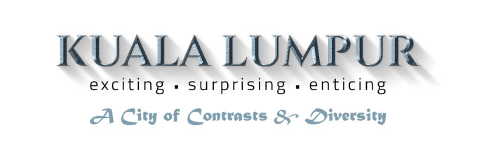
On 26th of April 2016, The Star's Bavani M published an article on "New Brand for KL". I honestly didn't even try to look for it - with Facebook and Twitter, we gets news and updates whether we want it or not - the good ones and the bad ones too. Unfortunately for me, this had made its way to my newsfeed.
So at first, I thought to myself - damn that's what a logo would look like when it's done in Powerpoint with one of the WordArt templates. I didn't say anything. I didn't have to because I knew other netizens would voice out whatever I was thinking.
I wasn't too farfetched with the Powerpoint WordArt template. Apparently the logo did came from a template. M. Shazni of Vulcan Post will show you step-by-step how it's done.
And this is the icing on the cake - guess how much tho logo costs? RM 15k! Yeap! A logo that was a result of a template costs RM 15,000! This is reported by Noraza Yusof, the city’s Tourism Bureau general manager. Here's the link.
I smell a big rat. Then again it could just be me and my nose.
NOT A FAN
Nope. I'm not a KL-ite, and I don't travel to KL very often. When I do, I rarely explore it's nooks and cranies to really appreciate what it offeres to those living in it and to those visiting.But I can say that this logo BARELY reflects KL itself. "The colour silver for the word Kuala Lumpur was meant to reflect the city’s tin mining roots" said Noraza. Wow. I totally get it, to reflect your root, your history, your past. That's fair. I mean, if not for this statement I would probably not have remembered that Kuala Lumpur started off as a tin mining town. #bimbomoment
But is there a physical legacy that's left behind? A tin mining museum on a site that was once a mine? Maybe a monument? I don't know. Maybe if you would comment some so I can probably visit next time I'm in KL that'd be awesome. It doesn't change the fact that the logo does not reflect that completely but at least one aspect of it did.
And if that's what you want to put forth, then why choose 'exciting . surprising . enticing' as your slogan? and not enough with just one, you have to have two slogans - A City of Contrasts & Diversity. It's confusing. "Noraza said diverse cultures and the juxtaposition of old and new were among the city’s strengths, and the branding focused on those". I say nope.
nope.
nope. nope. nope.

Juxtaposition is a harmonic contrasting effect that is comfortable to the eyes. Look at the logo. Are your eyes comfortable? The sharp lines that made up the font "Kuala Lumpur" in all caps. The thin lines in the font of the words "exciting . surprising . enticing" in small caps. The thick font of the slogan "A City of Contrasts and Diversity". It's like looking at 3 different things in one. Owh yes they're contrasting alright, but they are NOT in harmony.
And yes, while we're on the topic of fonts - 3 different fonts in 1 logo? It might work, given the right fonts - but in this case, my eyes hurt just looking at them.
I COULD GO ON FOR DAYS
City branding has been around. KL is not the first in it's initiative. But I believe that they made an error or jumping the guns. The mindset of creating something first then attributing things to it is very common among us Malaysians. I'm not saying ALL, just common. Especially when it comes to logo.
Why do I say this? Because it looks convenient. Why did we choose the colour silver? To represent tin mining history. Why 3 fonts? A juxtapose of old and new. Why 2 slogans? Because ...
They say in order to love something, you have to know it first. When other cities began branding themselves, they study the aspects of what made it unique, and capitalise on that.
Exciting? What is exciting about KL? I could only name just a few, others could name more, but the word 'exciting' don't reflect that. It's so generic! Even my back yard is exciting!
Surprising? Again, so ambiguous. So generic. So common.
Enticing? Nevermind. You get my point.
A City of Contrasts and Diversity? But isn't every other cities in Malaysia like that? Come to Sabah, in KK, count 10 people, most likely they're from different race and religion. Come to Miri, probably the same. From Georgetown in the north to JB in the South, most likely the same too.
Want a good slogan for a city? Look at these.
Las Vegas - What happens in Vegas, Stays in Vegas
It's provocative. It's epic. It's suggestive.
Increadinburgh
50-50 on this, but it's a good play on words.
California - Find Yourself Here
Upon reading this you wanna know more about it. That's enticing.
A Touch of the Exotic: Dumfries and Galloways, Scotland
Ethiopia: Thirteen Months of Sunshine
You go wtf? 13 months? But don't you just want to check the facts?
Just to name a few. What do they have in common? They ARE exciting. They ARE surprising. They ARE enticing. And they don't put those words to show people that.
Here's a slogan that I would put: We could be different, but we could be the same too. What do you think? Got a better one? Leave a comment. It's a long shot but who knows it might replace the current one.
IT'S NOT JUST FOR THE TOURISTS
Another point that these people deciding on the branding may have overlooked is that the branding should also address its people. At the end of the day, the heart of the city is the people. If the people feel strongly against the logo, then listen to what they have to say. If there are too many, use the tools at your disposals. Hashtags, wordclouds, sentiment analytic, analyze the social media and gather indirect responses. These are the meaningful ones.And if you're not aware of this, then maybe you're not ready to be branded.
.jpg)


0 comments :